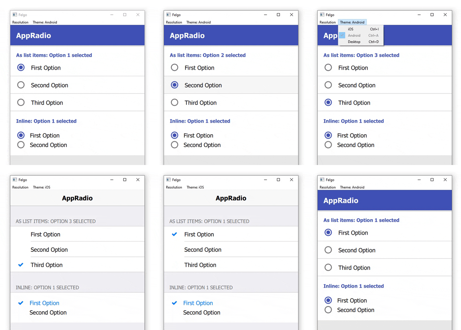
A radio with a platform-specific styling for iOS and Android. More...
| Import Statement: | import Felgo 4.0 |
| Since: | Felgo 2.7.1 |
| Inherits: |
The AppRadio component allows the user to select one of many choices. The AppRadio comes with a default look that matches platform-specific styles.
| iOS | Android |
|---|---|
|
|
|
Here is an example of how to use the new control, and how it can be combined with the AppListItem for a native UI/UX:

 import QtQuick
 import QtQuick.Controls as QC2
 import Felgo

 App {
   NavigationStack {
     AppPage {
       title: "AppRadio"
       backgroundColor: Theme.secondaryBackgroundColor

       Column {
         width: parent.width

         SimpleSection {
           title: "As list items: " + ratioButtonGroup1.checkedButton.value + " selected"
         }

         QC2.ButtonGroup {
           id: ratioButtonGroup1
           buttons: [radio1, radio2, radio3]
         }

         AppListItem {
           text: "First Option"
           showDisclosure: false

           leftItem: AppRadio {
             id: radio1
             checked: true
             value: "Option 1"
             anchors.verticalCenter: parent.verticalCenter
           }

           onSelected: {
             if(!radio1.checked) radio1.toggle()
           }
         }

         AppListItem {
           text: "Second Option"
           showDisclosure: false

           leftItem: AppRadio {
             id: radio2
             value: "Option 2"
             anchors.verticalCenter: parent.verticalCenter
           }

           onSelected: {
             if(!radio2.checked) radio2.toggle()
           }
         }

         AppListItem {
           text: "Third Option"
           showDisclosure: false
           lastInSection: true

           leftItem: AppRadio {
             id: radio3
             value: "Option 3"
             anchors.verticalCenter: parent.verticalCenter
           }

           onSelected: {
             if(!radio3.checked) radio3.toggle()
           }
         }

         SimpleSection {
           title: "Inline: " + ratioButtonGroup2.checkedButton.value + " selected"
         }

         QC2.ButtonGroup {
           id: ratioButtonGroup2
           buttons: [radio4, radio5]
         }

         Rectangle {
           width: parent.width
           height: contentCol.height

           Column {
             id: contentCol
             width: parent.width
             padding: dp(Theme.contentPadding)

             AppRadio {
               id: radio4
               value: "Option 1"
               text: "First Option"
               checked: true
             }

             AppRadio {
               id: radio5
               value: "Option 2"
               text: "Second Option"
             }
           }
         }
       }
     }
   }
 }
|
borderColorOff : color |
The color of the radio's border if it is unchecked. Matches Theme::appRadio.borderColorOff by default.
|
borderColorOffDisabled : color |
The color of the radio's border if it is unchecked and disabled. Matches Theme::appRadio.borderColorOffDisabled by default.
|
borderColorOn : color |
The color of the radio's border if it is checked. Matches Theme::appRadio.borderColorOn by default.
|
borderColorOnDisabled : color |
The color of the radio's border if it is checked and disabled. Matches Theme::appRadio.borderColorOnDisabled by default.
|
borderWidth : real |
The width of the radio's border. Matches dp(Theme::appRadio.borderWidth) by default.
|
circleSize : real |
The size for the checked circle within the radio, if useIcons is set to false. The default value is dp(Theme.appRadio.circleSize).
|
fillColorOff : color |
The fill color of the radio if it is unchecked. Matches Theme::appRadio.fillColorOff by default.
|
fillColorOffDisabled : color |
The fill color of the radio if it is unchecked and disabled. Matches Theme::appRadio.fillColorOffDisabled by default.
|
fillColorOn : color |
The fill color of the radio if it is checked. Matches Theme::appRadio.fillColorOn by default.
|
fillColorOnDisabled : color |
The fill color of the radio if it is checked and disabled. Matches Theme::appRadio.fillColorOnDisabled by default.
|
iconColorOff : color |
The color of the checked icon if the radio is unchecked. Matches Theme::appRadio.iconColorOff by default.
|
iconColorOffDisabled : color |
The color of the checked icon if the radio is disabled and unchecked. Matches Theme::appRadio.iconColorOffDisabled by default.
|
iconColorOn : color |
The color of the checked icon if the radio is checked. Matches Theme::appRadio.iconColorOn by default.
|
iconColorOnDisabled : color |
The color of the checked icon if the radio is disabled and checked. Matches Theme::appRadio.iconColorOnDisabled by default.
|
iconOff : string |
The icon that is shown within the radio in checked state. The default value is Theme.appRadio.iconOff
To hide the icon, set iconColorOn to "transparent".
|
iconOn : string |
The icon that is shown within the radio in unchecked state. The default value is Theme.appRadio.iconOn
To hide the icon, set iconColorOff to "transparent".
|
iconSize : real |
The size for the checked icon within the radio. Matches Theme::appRadio.iconSize by default.
|
indicatorHeight : real |
The height of the indicator of the radio. This refers to the rectangle that contains either the icon or the circle indicator, depending on useIcons. The default value is
dp(Theme.appRadio.indicatorHeight).
|
indicatorWidth : real |
The width of the indicator of the radio. This refers to the rectangle that contains either the icon or the circle indicator, depending on useIcons. The default value is
dp(Theme.appRadio.indicatorWidth).
|
labelColorOff : color |
The color of the label text if the radio is unchecked. Matches Theme::appRadio.labelColorOff by default.
|
labelColorOffDisabled : color |
The color of the label text if the radio is disabled and unchecked. Matches Theme::appRadio.labelColorOffDisabled by default.
|
labelColorOn : color |
The color of the label text if the radio is checked. Matches Theme::appRadio.labelColorOn by default.
|
labelColorOnDisabled : color |
The color of the label text if the radio is disabled and checked. Matches Theme::appRadio.labelColorOnDisabled by default.
|
labelFontSize : real |
The font size of the label text of the radio. Matches sp(Theme::appRadio.labelFontSize) by default.
|
radius : real |
The border radius of the radio. Matches dp(Theme::appRadio.radius) by default.
|
updateChecked : bool |
If set to false, the control does not change its checked property when it is clicked.
This might be useful if the property is bound to a value that should not be overwritten. The clicked signal is fired in any case and allows to react to user interactions.
The default value is true.
|
useIcons : bool |
Set this property to true to show the radio state with an AppIcon. Set it to false to show the state with a filled or empty dot.
The default value uses the value of Theme.appRadio.useIcons.
|
value : var |
This is a helper property for easier evaluation and processing of the checked radio button.
See Customize AppListItems for custom Lists for an example usage.