ThemeTabControl
Defines style of the TabControl. More...
| Import Statement: |
import Felgo 4.0 |
| Inherits: |
QtObject
|
Properties
Detailed Description
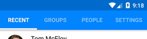
This type is used in the global Theme object for the appearance of TabControl.
Property Documentation
The background color fills the TabControl's background.
By default, the color matches the target platform.
The divider is displayed as a thin line at the very top of the tab bar. Override the divider color to customize the look of the divider.
By default, this is chosen to match the target platform.
Whether the tab title is displayed bold. Matches platform-specific values by default.
This property was introduced in Felgo 2.7.0.
The Text::font.capitalization setting of the title. Matches platform-specific settings by default.
This property was introduced in Felgo 2.7.0.
Height of the tab bar, in pixels.
By default, this is chosen to match the target platform.
The size of the tab icons used for tab bar, in pixels. This value matches platform specific values and should only be overridden if customization is needed.
This property was introduced in Felgo 2.7.0.
The color of the bottom line that marks the active tab on Android.
This property was introduced in Felgo 2.7.0.
Whether the specified icon should be shown within a tab. By default, the icon is hidden on Android and visible on iOS.
This property was introduced in Felgo 2.7.0.
The size of the title displayed for each tab. The default setting matches platform specific values. This property only applies for sub-tabs based on AppTabButton.
This property was introduced in Felgo 2.9.2.
The title color defines the font color of the currently selected title label and the icon. This color only applies for sub-tabs based on AppTabButton.
By default this property matches the target platform.
This property was introduced in Felgo 2.9.2.
|
subTabTitleOffColor : color
|
The off color defines the font color of the title label and the icon of all tabs except the selected one. This color only applies for sub-tabs based on AppTabButton.
By default this property matches the target platform.
This property was introduced in Felgo 2.9.2.
|
subTabTitlePressedColor : color
|
The pressed color defines the font color of the title label and the icon for a tab that is being pressed. This color only applies for sub-tabs based on AppTabButton.
By default this property matches the subTabTitleOffColor.
This property was introduced in Felgo 2.17.0.
|
textMaximumLineCount : int
|
The Maximum line count for the title text of each tab. Matches platform specific values by default.
This property was introduced in Felgo 2.7.0.
The size of the title displayed for each tab. Matches platform specific values. This property only applies for main-tabs based on NavigationItem.
This property was introduced in Felgo 2.7.0.
The title color defines the font color of the currently selected title label and the icon. This color only applies for main-tabs based on NavigationItem.
By default this property matches the target platform.
|
titleDisabledColor : color
|
The disabled color defines the color of labels and icons for tabs that are disabled. By default it's a transparent variant of titleOffColor.
By default this property matches the target platform.
This property was introduced in Felgo 3.7.0.
The off color defines the font color of the title label and the icon for tabs that are not selected. This color only applies for main-tabs based on NavigationItem.
By default this property matches the target platform.
|
titlePressedColor : color
|
The pressed color defines the font color of the title label and the icon for a tab that is being pressed. This color only applies for main-tabs based on NavigationItem.
By default this property matches the titleOffColor.
This property was introduced in Felgo 2.17.0.


