SimpleRow
A ListView delegate item with two labels and an optional image. More...
| Import Statement: |
import Felgo 4.0 |
| Inherits: |
Item
|
Properties
Signals
Detailed Description
SimpleRow is a simple row intended to be used for ListView::delegate.
It shows a large text, a small detailText and an image or icon.
When using a ListPage, the ListView::model property is automatically set to a Component that creates SimpleRow objects.
Default Usage
SimpleRow automatically extracts properties from the ListView::model data objects. The following properties can be used:
-
text: string for the displayed text.
-
detailText: string for the displayed detailText.
-
iconType: IconType for the displayed iconSource.
-
image: url for the displayed imageSource.
-
active: bool, whether the row should be highlighted.
-
visible: bool, whether the row should be shown at all.
-
enabled: bool, whether the row should be enabled, and click events emitted.
This way, the ListView::model can be chosen wisely so SimpleRow's properties do not have to be changed manually. The following code taken from the
widget showcase app shows how its done:
 AppListView {
   delegate: SimpleRow {}
   model: [
     { text: "Widget test",
       detailText: "Some of the widgets available in Felgo AppSDK",
       iconType: IconType.tablet },
     { text: "Shown are:",
       detailText: "ListPage, NavigationBar with different items, Switch",
       iconType: IconType.question }
   ]
 }
Advanced Usage
The ListView model objects can be accessed via the item property. This way, additional functionality can be added,
like changing the text based on other properties:
AppListView {
model: DataModel.users
delegate: SimpleRow {
text: item ? item.firstName + " " + item.lastName : ""
}
}
Note: item is taken from the model and can be null when initializing the row object, so the item ? ... : "" checks are necessary.
How do I know which list item is clicked on?
The SimpleRow::selected signal allows to handle click events on a list cell. For custom delegate items, you can add your own MouseArea for handling touch input.
 import Felgo

 App {
  NavigationStack {
    AppPage {
      title: "Clickable List Example"

      AppListView {
        delegate: SimpleRow {
          onSelected: console.log("Clicked Item #"+index+": "+JSON.stringify(modelData))
        }
        model: [
          {
            text: "Apple",
            detailText: "A delicious fruit with round shape",
            iconType: IconType.apple
          },

          {
            text: "Beer",
            detailText: "A delicous drink",
            iconType: IconType.beer
          }
        ]
      }
    }
  }
 }
How do I update ListViews dynamically?
The list view updates its UI automatically whenever the model changes - at least when you describe your model as a ListModel type.
For plain JSON-based models, the list is not notified when some data values within the JSON structure change. In this case, you can manually trigger a property-changed signal, which in turn updates the UI of the list:
import Felgo
App {
NavigationStack {
AppPage {
id: page
title: "Append List Item Example"
property var listData: [
{
text: "Apple",
detailText: "A delicious fruit with round shape",
iconType: IconType.apple
},
{
text: "Beer",
detailText: "A delicous drink",
iconType: IconType.beer
}
]
AppListView {
id: listView
model: page.listData
delegate: SimpleRow {
onSelected: {
page.listData.push(modelData)
page.listDataChanged()
}
}
}
}
}
}
More Frequently Asked Development Questions
Find more examples for frequently asked development questions and important concepts in the following guides:
Property Documentation
Chooses whether the row should be highlighted.
By default, this is bound to item.active.
|
alignTextWithTitle : bool
|
If you show an image or icon in the first SimpleRow column, the textItem and detailTextItem align with the title position in the navigation bar. This is only the case when the Theme.navigationBar.titleAlignLeft setting is used, which is the default style on Android.
Deactivate the alignTextWithTitle property to not include additional text spacing, regardless of the theme configuration and platform style that is used.
This property was introduced in Felgo 3.9.2.
Whether the image should automatically change its size to match the height of the SimpleRow. True by default.
A maximum height for the auto-sizing can bes set with the imageMaxSize property.
This property is used to change the color of the badge if using badgeValue to display a badge.
This property was introduced in Felgo 3.3.0.
An optional value that's displayed as badge within the simple row.
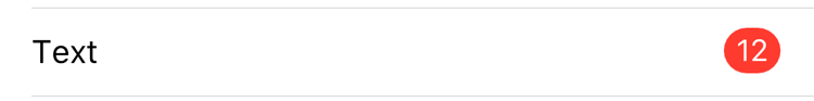
The appearance of badge can be styled with the style property or globally with Theme::listItem properties:
import Felgo
App {
onInitTheme: {
Theme.listItem.badgeFontSize = 12
Theme.listItem.badgeTextColor = "white"
Theme.listItem.badgeBackgroundColor = "grey"
Theme.listItem.badgeRadius = 4
}
ListPage {
model: 1
delegate: SimpleRow {
text: "Text"
badgeValue: "12"
}
}
}
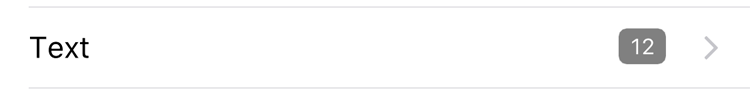
This property was introduced in Felgo 2.16.1.
The small detail text to display at the bottom in the row.
By default, this is bound to item.detailText.
The Text item used for displaying the detail text.
The source for the AppIcon to display at the left in the row. If not set, no icon is shown. Only either iconSource or imageSource
should be set at a time.
By default, this is bound to item.icon.
Maximum width or height of the image, if autoSizeImage is set to true.
This property was introduced in Felgo 2.6.2.
The source for the AppImage to display at the left in the row. If not set, no image is shown. Only either iconSource or imageSource
should be set at a time.
By default, this is bound to item.image.
If an array is used as the ListView::model for this row, this property contains the current element. The item is used per default for properties
in SimpleRow and can also be accessed externally. If the model is not represented as an array, the SimpleRow properties cannot be initialized
automatically.
It can be any JS object. When using a ListModel, item is set to null.
The RippleMouseArea item used for interactions.
This property was introduced in Felgo 3.7.0.
Convenience property to hide the disclosure icon of the row, which is displayed by default on iOS.
This property was introduced in Felgo 3.3.0.
The StyleSimpleRow configuration sets the colors and sizes to be used for the SimpleRow. The default style uses the standard configuration of the
Theme::listItem property.
This property was introduced in Felgo 2.6.2.
The large header text to display at the top in the row.
By default, this is bound to item.text.
The Text item used for displaying the item text.
Signal Documentation
Emitted when this row has been clicked. The index parameter is this row's index in the ListView model.
Note: The corresponding handler is onSelected.


