NavigationBarRow
Container item to display multiple NavigationBarItems within a NavigationBar. More...
Properties
Methods
Detailed Description
The NavigationBarRow item allows to display multiple NavigationBarItems in the left or right item slot of a NavigationBar.
Simple Usage
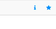
The following example shows how to display an activity indicator and an icon button in the right slot of NavigationBar:
NavigationBar {
rightBarItem: NavigationBarRow {
ActivityIndicatorBarItem {
id: activityIndicator
}
IconButtonBarItem {
iconType: IconType.toggleon
onClicked: { console.log("item clicked") }
}
}
}
This is the easiest way of using the NavigationBarRow item. You can insert default items like the IconButtonBarItem or the ActivityIndicatorBarItem, or create and use a custom item based on the NavigationBarItem type.
Advanced Usage
On some platforms, like Android, it is common to only show the most important items in the navigation bar. Less important items are hidden initially and may be accessed through a submenu. Whenever there are hidden items, a
"show more" button is displayed that opens up the submenu.
The NavigationBarRow supports this feature automatically. By default, the behavior is different depending on the platform. On Android, items are collapsed to the submenu. On iOS all items are shown, which is the expected
behavior.
The following example sets some properties for the items of the row to configure the "show more" feature:
 NavigationBar {
   rightBarItem: NavigationBarRow {

     IconButtonBarItem {
       iconType: IconType.info
       title: "Info"
       showItem: Theme.isIos ? showItemAlways : showItemNever
     }

     IconButtonBarItem {
       iconType: IconType.star
       title: "Favorites"
     }

   }
 }
The NavigationBarRow uses the NavigationBarItem::title property to display the hidden items in the submenu.
On Android, the row automatically hides items if there's not enough space available in the navigation bar. By changing the NavigationBarItem::showItem property to
showItemNever, we override this setting to always add the "Info" button to the submenu.
On iOS, the NavigationBarRow::showMoreButton feature is deactivated. This means that the submenu, which would contain the hidden "Info" button, is not available.
To fix this, we use the showItemAlways setting for the button on iOS.
This is how the result looks like:
| Android |
iOS |
|

|
|
It is important to think about which items to show or hide on which platform. To match platform-specfic conventions it is best practice to only use the "show more" feature on Android, like in the example above. As this can
lead to hidden items on iOS, it might be practical to offer the hidden options somewhere else within your app.
The next section explains the "show more" feature in more detail.
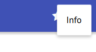
When using the NavigationBarRow to display multiple items, the available width in the navigation bar limits the number of items that can be displayed. The "show more" button provides a way to move some items to a submenu. This
submenu is available with only a single button in the navigation bar.
| "show more" button (three vertical dots) |
submenu with an "Info" button |
|
|
|
To be able to display the items of a row within this submenu, set the NavigationBarItem::title property to configure the text that is shown.
NavigationBar {
rightBarItem: NavigationBarRow {
IconButtonBarItem {
iconType: IconType.info
title: "Info"
}
IconButtonBarItem {
iconType: IconType.star
title: "Favorites"
}
}
}
By default, the NavigationBarRow behaves differently depending on the platform. On Android, no more changes are needed to automatically get a submenu. If there's not enough space available in the NavigationBar, some items are hidden. Depending on the interface orientation and the size of the NavigationBar::titleItem, few or many items
might be added to the submenu. On iOS the "show more" feature is deactivated and all items are shown.
To manually configure which items are shown set the showItem property of an individual item to one of the following options:
Note: Do not use showItemAlways with too many items, as the NavigationBarRow may overlap with other elements in the NavigationBar.
The following example always hides the "Info" button:
 NavigationBar {
   rightBarItem: NavigationBarRow {

     IconButtonBarItem {
       iconType: IconType.info
       title: "Info"
       showItem: showItemNever
     }

     IconButtonBarItem {
       iconType: IconType.star
       title: "Favorites"
     }
   }
 }
Even if there's enough space, the "Info" button is hidden and only available through the submenu.
In the example above the "Info" button won't be available for iOS. The default NavigationBarRow::showMoreButton setting prevents hidden items to be accessed. If
you like to hide the button only on Android, you can add this simple check to your code:
 NavigationBar {
   rightBarItem: NavigationBarRow {

     IconButtonBarItem {
       iconType: IconType.info
       title: "Info"
       showItem: Theme.isIos ? showItemAlways : showItemNever
     }

     IconButtonBarItem {
       iconType: IconType.star
       title: "Favorites"
     }

   }
 }
Now we see all the icons on iOS, but use a submenu on Android.
| Android |
iOS |
|
|
|
As these examples already show, it is important to consider which items to show or hide on which platform. The easiest way would be to use the NavigationBarRow::showMoreButton feature in conjunction with the NavigationBarItem::showItemIfRoom setting on
all platforms. This ignores the convention of not using a "show more" button on iOS. As a best practice the showMoreButton option should only be used on Android. On
iOS it's therefore more practical to offer the hidden options somewhere else within your app.
Property Documentation
Set this property to show or hide the "show more" button for the row. Clicking the "show more" button will display an overlay that contains the hidden NavigationBarItems. By
default this is enabled for Android and disabled for iOS.
Note: This means that by default, a hidden item on iOS is not accessible at all. To be able to access these features, either provide them in some other way or set showMoreButton to true. Usually iOS
apps do not use a "show more" button in the navigation bar.
The NavigationBarRow uses the NavigationBarItem::title property to display the hidden items in the overlay. Whether a
NavigationBarItem is visible or hidden is decided based on the NavigationBarItem::showItem configuration.
This property was introduced in Felgo 2.7.0.
See also NavigationBarItem::title and NavigationBarItem::showItem.
Method Documentation
|
[since Felgo 2.7.0] addItem(component, properties)
|
NavigationBarRow::addItem(component, properties)
This function allows to dynamically add items to the row. The component parameter states the item component. An instance of this component will be created and added to the NavigationBarRow. The optional properties parameter allows to set initial properties for the item.
This method was introduced in Felgo 2.7.0.


