Learn what Felgo offers to help your business succeed. Start your free evaluation today! Felgo for Your Business

AppButton

A button with a default raised and flat button style. More...

Import Statement: import Felgo 4.0
Inherits:

Button

Inherited By:

AppleSignInButton and SwipeButton

Properties

Detailed Description

The AppButton comes with a default look that matches platform-specific styles.

Example Usage

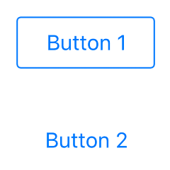
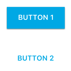
The AppButton component supports two different styles that can be switched with the Button::flat property.

 import Felgo
 import QtQuick

 App {
   AppPage {
     Column {

       AppButton {
         text: "Button 1"
         flat: false
       }

       AppButton {
         text: "Button 2"
         flat: true
       }

     }
   }
 }

The first button is styled with Button::flat property set to false (the default style on Android), the second one with true (the default on iOS):

iOS Android

How do I add an onClick listener to the button?

The following example adds an AppButton and handles the clicked signal:

 import Felgo

 App {

   AppButton {
     text: "Click Me!"
     anchors.centerIn: parent
     onClicked: text = "Thanks!"
   }

 }

More Frequently Asked Development Questions

Find more examples for frequently asked development questions and important concepts in the following guides:

Property Documentation

backgroundColor : color

The background color of the button in the default state. Matches Theme::appButton.backgroundColor by default.


[since Felgo 4.0.0] backgroundColorHovered : color

The background color of the button when hovered. Matches Theme::appButton.backgroundColorHovered by default.

This property was introduced in Felgo 4.0.0.


backgroundColorPressed : color

The background color of the button when pressed. Matches Theme::appButton.backgroundColorPressed by default.


borderColor : color

The color of the border. Matches Theme::appButton.borderColor by default.


[since Felgo 2.7.1] borderColorDisabled : color

The color of the border if the button is disabled. Matches Theme::appButton.borderColorDisabled by default.

This property was introduced in Felgo 2.7.1.


[since Felgo 4.0.0] borderColorHovered : color

The color of the border if the button is hovered. Matches Theme::appButton.borderColorHovered by default.

This property was introduced in Felgo 4.0.0.


borderColorPressed : color

The color of the border if the button is pressed. Matches Theme::appButton.borderColorPressed by default.


borderWidth : real

The width of the border. Matches Theme::appButton.borderWidth by default.


disabledColor : color

The background color of the button when disabled. Matches Theme::appButton.disabledColor by default.


[since Felgo 2.6.2] dropShadow : bool

Whether a drop shadow should be added to the background of the button. Matches Theme::appButton.dropShadow if the button is enabled, false otherwise.

This property was introduced in Felgo 2.6.2.


[since Felgo 2.6.2] fontBold : bool

Whether the button text should be bold. The default value matches Theme::appButton.fontBold.

This property was introduced in Felgo 2.6.2.


[since Felgo 2.6.2] fontCapitalization : int

The Text::font.capitalization setting. The default value matches Theme::appButton.fontCapitalization.

This property was introduced in Felgo 2.6.2.


fontFamily : string

The font family of the button's text. By default the Theme font is used.


[since Felgo 2.6.2] horizontalMargin : real

The margin to the left and right of the button. Theme::appButton.horizontalMargin is used by default.

This property was introduced in Felgo 2.6.2.


[since Felgo 3.7.0] iconLeft : string

The optional icon that shall be displayed to the left the button text. It overrides AppButton.leftItem if set.

This property was introduced in Felgo 3.7.0.


[since Felgo 3.7.0] iconRight : string

The optional icon that shall be displayed to the right the button text. It overrides AppButton.rightItem if set.

This property was introduced in Felgo 3.7.0.


[since Felgo 2.7.0] iconSize : real

The size of the button's icon. The default value matches Theme::defaultIconSize.

This property was introduced in Felgo 2.7.0.


[since Felgo 4.0.0] iconType : string

The optional icon that shall be displayed above the button text.

Use one of the IconType constants with this property.

Note: This property was renamed from icon in Felgo 4.0.0. This is because the base type already has the property AbstractButton::icon in Qt Quick Controls 2.

This property was introduced in Felgo 4.0.0.


[since Felgo 3.7.0] innerSpacing : real

The spacing between custom AppButton.leftItem or AppButton.rightItem and the button text. Theme::appButton.innerSpacing is used by default.

This property was introduced in Felgo 3.7.0.


[since Felgo 3.7.0] leftItem : Item

Custom Item that appears to the left of the button text.

This property was introduced in Felgo 3.7.0.


[since Felgo 2.7.0] minimumHeight : real

The minimum height of the button without margins. It matches Theme::appButton.minimumHeight.

This property was introduced in Felgo 2.7.0.


[since Felgo 2.6.2] minimumWidth : real

The minimum width of the button without margins. It matches Theme::appButton.minimumWidth, or Theme::appButton.flatMinimumWidth if Button::flat is set to true.

This property was introduced in Felgo 2.6.2.


radius : real

The border radius of the button. The default value matches Theme::appButton.radius.


[since Felgo 3.7.0] rightItem : Item

Custom Item that appears to the left of the button text.

This property was introduced in Felgo 3.7.0.


[since Felgo 2.18.2] rippleEffect : bool

Whether the button shows a ripple effect when pressed. Defaults to Theme::appButton.rippleEffect.

You can also hide the ripple effect for all buttons with the app theme:

 import Felgo

 App {
   onInitTheme: {
     Theme.appButton.rippleEffect = false // disable ripple effect
   }
 }

This property was introduced in Felgo 2.18.2.


textColor : color

The color of the button's text. The default matches the Theme::appButton.textColor or flatTextColor configuration.


[since Felgo 2.7.1] textColorDisabled : color

The color of the button's text if it is disabled. The default matches Theme::appButton.textColorDisabled.

This property was introduced in Felgo 2.7.1.


[since Felgo 4.0.0] textColorHovered : color

The color of the button's text if it is hovered. The default matches Theme::appButton.textColorHovered.

This property was introduced in Felgo 4.0.0.


[since Felgo 2.6.2] textColorPressed : color

The color of the button's text if it is pressed. The default matches Theme::appButton.textColorPressed or Theme::appButton.flatTextColorPressed.

This property was introduced in Felgo 2.6.2.


[since Felgo 2.12.0] textFont : font

This property gives full access to all font settings of the text within AppButton.

This property was introduced in Felgo 2.12.0.


[since Felgo 2.17.1] textFormat : int

The way the text property should be displayed. Supported text formats are:

  • Text.AutoText (default)
  • Text.PlainText
  • Text.StyledText
  • Text.RichText

See QtQuick::Text::textFormat for more details.

This property was introduced in Felgo 2.17.1.


textSize : real

The font size of the button text. The default value matches Theme::appButton.textSize.


[since Felgo 2.6.2] verticalMargin : real

The margin at the top and bottom of the button. Theme::appButton.verticalMargin is used by default.

This property was introduced in Felgo 2.6.2.


[since Felgo 2.7.0] wordWrap : bool

Whether the button text uses multiple lines if it is bigger than the minimumWidth. The default value is false.

This property was introduced in Felgo 2.7.0.


Qt_Technology_Partner_RGB_475 Qt_Service_Partner_RGB_475_padded